

Introducing The New Website
Plus my newsletter has a name!

Some of you may have noticed in the last few weeks a new look to taylorswiftstyle.com.
I quietly soft launched it in the middle of January, but only officially announced it yesterday on Instagram. The new website has been in the pipeline since April 2024 when I tapped the incredible KETZ team to give the blog - and TSS as a whole - a makeover. After all, the last time I touched the blog’s CSS was in 2017. Yeesh.

Much like the details of the Taylor Swift Style book cover - and as a running theme in my life, generally - I overthought many aspects of the new TSS branding. Anyone else relate? Last year, when I first began working with KETZ, I created a moodboard to capture the vibe I was going for.

It was important to me that the branding made reference to the Taylor Swift Style book cover. They’re both extensions of me and my preferences - natch - but they both also function as the primary homes of TSS content. As such, I thought they should both have a coordinating-but-not-matching essence of TSS. A TSSence, if you will.


Font: I’ve always been inspired by fashion magazines and newspapers alike. Issues of Vogue and copies of my local paper were the editorial bodies by which I made so many choices in my life. The style trends I adhered to and the career paths I forged were both paved by the works of fashion journalists and news reporters alike. As such, I wanted a primary logo font that felt modern, editorial, and that nodded to a print publication (fashion or news).
You might also notice a few nods to handwritten type about the site (including my own - yes, actually - signature). I wanted this to evoke a certain “editor’s note” like those I’d see in the opening pages of a monthly glossy issue and also a slightly Swiftian diaristic nod as well.

Illustrations: In the same vein as the fashion magazine vibe, I wanted to incorporate fashion illustrations throughout the site as well. They also nod a little bit to the original Eras sweatshirt - how long ago that feels! I picked what I felt were the most iconic and recognizable outfits from every era and KETZ worked with an illustrator to bring them to life. They’re scattered throughout the site, but feature most prominently on the Eras page.

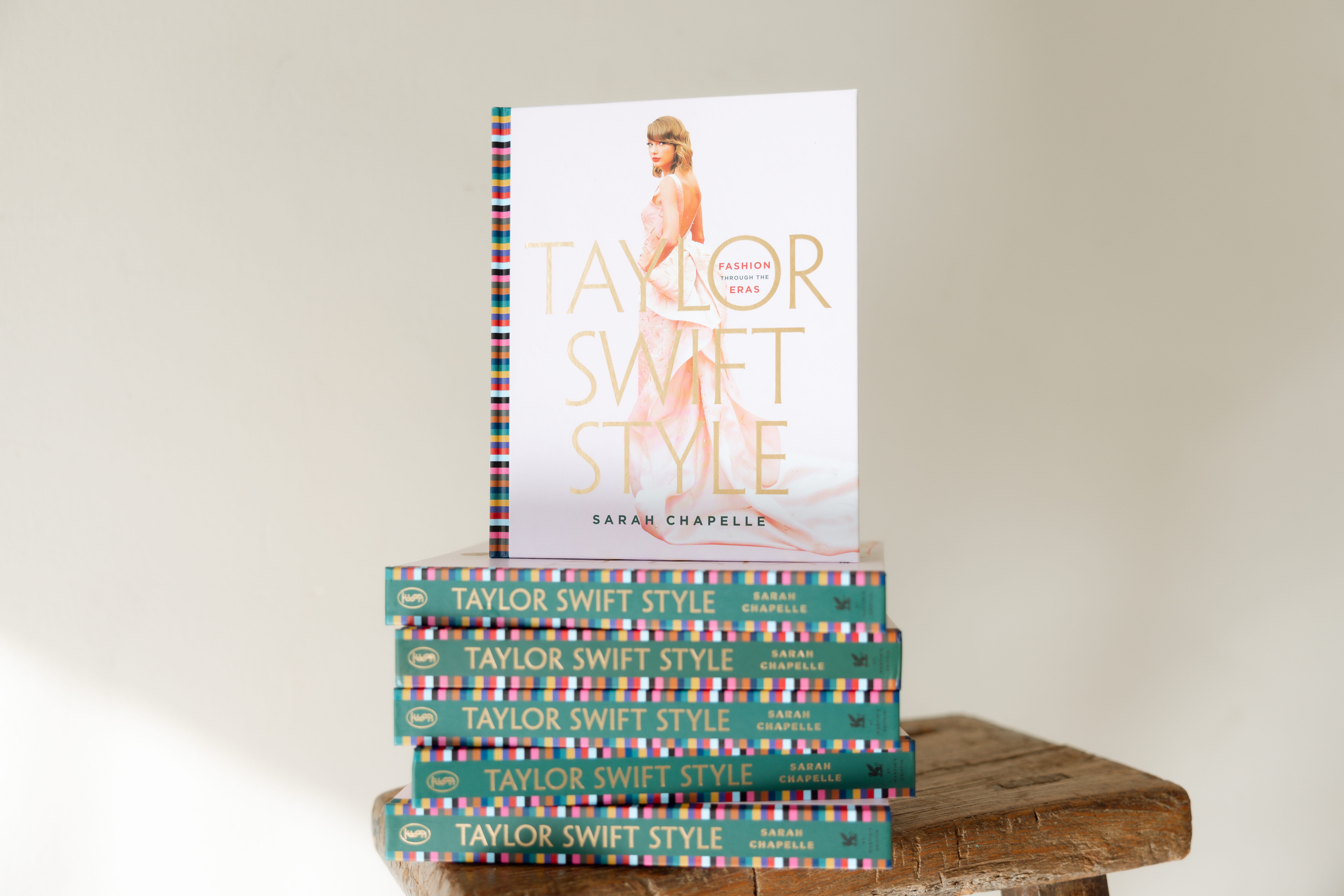
TSS Green: Landing on just the right shade of green was a pivotal part of the process. I think KETZ absolutely nailed it with their palette choices. This is also an almost exact shade match for the coloured end pages in Taylor Swift Style which I also handpicked (as I did the colours of each of the eras on the external gutter detail).

TSS Gold: This was a direct bit of inspiration from the design of Taylor Swift Style (Book Version). In case you didn’t know - the front cover and page edges of the book are gilded in a stunning, shiny gold foil. I think this detail really elevates the book to something truly special and coffee table-worthy. Originally, the gold foil was in reference to how Taylor once hoped to write an album about “realizing that real love shines golden like starlight, and doesn’t fade or spontaneously combust.” I wanted to incorporate something into the book’s design that symbolized the enduring emblem of golden light that Taylor’s music has cast on me for over half my life. Like daylight. Naturally, it made sense to bring that over onto the site. You’ll see glimpses of it in select places, typically adjacent to a personal photo of myself. But you see it most prominently …

The newsletter has its own name now - and that name deserved its own branding. Welcome to Liner Notes!
While I’ve been faithfully blogging on the website since 2011, I’ve also been writing some form of a newsletter since 2019. First hosted on Patreon, then migrated over here to Substack, and now officially dubbed with a name. While the blog functions as a place to shop Taylor’s fashion exacts and read critically kind outfit commentary, the newsletter gives me more room to stretch editorially. To stretch the limits of word count in the form of essays like fashion deep dives on Versace’s Medusa or the meaning of plaid or other Taylor-adjacent content such as reviews and recaps. But also in terms of boundaries, sharing personal style recommendations and updates from my life and POV.
The content here is meant to be both more exclusive and also more intimate. The branding and name were chosen with that in mind. The gold foil is meant to denote something “special” and precious to the eye. Something noteworthy. Because it’s shiny! And we like shiny things. (Name that tune.) The name — Liner Notes — was actually entirely Kelly’s idea - and a genius one at that. It was inspired by Taylor embedding secret messages in the liner notes of her earliest albums. Much like everything to do with TSS, my hope is that you’re inspired to read with a closer and more careful (+ critical) eye. To lean in. To uncover. To unpack. And then, most importantly, to find joy in the shared whispers of other people who take the time and the care and the effort to read the liner notes and the messages they find there. A real ‘iykyk’ amongst close friends who treat the comments section with equal respect and thrill as the blog copy itself.

Most importantly, the new site not only got an aesthetic makeover but a functional one as well.
Some of the new features added include:

🔎 Searchable Filters: A top request! In addition to existing filters (occasion, designer, era) you can now search items by price (<$100) and colour.
🔁 Repeats: Much to the chagrin of Kate Sanders, Taylor Swift is an outfit repeater. You can also filter items by repetition and go to individual product pages to see all the times that item has been reworn.
🕰️ Eras: A breakdown of each era’s iconic style and a convenient jumping off point to explore every look from that period. In keeping with the ‘magazine’ theme, I’ve also incorporated fashion illustration sketches based on the most iconic outfits of every era.
🛒 Shop: A core of TSS is not just providing exact purchase links for items, but also providing commentary that contextualizes that item. However, understanding that sometimes we just want to buy things (I get it) a big part of optimizing the website was to make it more shoppable. If you’re looking for an item and not a post with all its commentary, you can now search for products and not posts.

💄 Favourites: What’s Taylor’s go-to red lip? Perfume? A new shoppable page just for that.
⌛ Archive: I hope you love it but I also hope you stick with me as I work out all the bugs. It’s not a relaunch unless something is broken (or at least in the process of being fixed). There are 13 years of content to move to the new site. Aka a lot going on at the moment. In the interim, all the old posts (From The Vault) are still on the old site and accessible during this transition.

🤪 Pun Easter Egg Hunt: Okay so this isn’t “technically” a “usable” ““feature”” that is “““helpful””” to the website. I guess! But one of the best parts about the design process was burying puns throughout the copy. I hope you have a fun time finding them all and get as much of a kick out of them as we did writing them.
I hope you enjoy clicking through the new site and, of course, let me know if you have any questions or even content requests for the newsletter moving forward.

Congratulations, Sarah! I've been following TSS for the longest time (2010 or so) and I feel like someone close to me won something major in life!
Amazing! It is beautiful and the upgrade is so fitting to the growth of the website. I feel so privileged to have seen it go from the tumblr, to the 'proper' URL, to this absolute masterpiece :)